Telus World of Science
A science centre is easy to wander, and easy to lose. We built a mobile AR app that routes you to the next exhibit, rewards the find with a stamp, and adapts to how you need to move.
Role: AR & 3D development, UX
Built and on-site tested
a mobile AR app that routes you to an exhibit, rewards the find with a stamp, and adapts to how you need to move.
- Year
- 2024
- Venue
- Telus World of Science, Edmonton
- Team
- With Rachel Nhan & Steph Flordelis · MacEwan
- Scope
- AR navigation, stamp book, accessibility
- Stack
-
- Figma
- Adobe Aero
- Blender
Overview
Telus World of Science is Edmonton's science centre: easy to wander, easy to lose. Partnered with the centre and Elixir Simulations, three of us designed a mobile AR app for visitors, with real-time wayfinding, a stamp book that rewards exploration, and accessibility built in rather than added late.
My role
I worked on research, user flows, wireframing, interaction design, and testing, and owned the technical side: the 3D modelling in Blender and the AR prototyping in Adobe Aero that turned the concept into something you could hold up and follow.
With Rachel Nhan & Steph Flordelis
The problem
A building full of wonder, easy to lose your way in
A science centre should feel exploratory, for families, kids, and guests of every ability. But with hundreds of exhibits, a layout that shifts, and a wide range of visitor needs, a clear and accessible path is hard to hold. Plenty of visitors end up disoriented and miss the moments they came for.
- 01
Easy to get lost
Missing signs and unclear elevator directions leave guests turned around, leaning on staff and breaking the flow of the visit, especially when it is busy.
- 02
A map that does not help
The existing maps are hard to read and never adapt. With no real-time guidance or accessible format, visitors lose their place or miss whole areas.
- 03
Hands-off for hands-on learners
Younger visitors bounce off text-heavy panels, and fragile displays add caution. There is little room to explore an idea through play.
- 04
Exhibits that do not pull you in
Static displays and a shortage of fresh technology dull the draw, especially for repeat visitors, so engagement and recall both drop.
The solution
Three moves answered it
AR arrows, in real time
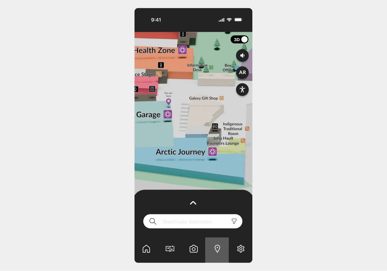
Pick an exhibit and follow AR arrows to it, plus restrooms and key areas.
Choose a destination on the built-in map and the app overlays AR arrows along the route, so finding exhibits and key areas no longer leans on staff.
The Problem It Answers
Guests got lost, and the static map never adapted to help. Real-time AR arrows give directions that move with them.
A digital stamp book
Collect a stamp at each exhibit you reach. Progress, reward, discovery.
An interactive stamp system rewards interacting with exhibits, turning the visit into a sense of progress and discovery for hands-on learners.
The Problem It Answers
Text-heavy panels lost younger visitors and static displays dulled the draw. Collecting stamps turns the visit into something to play through.
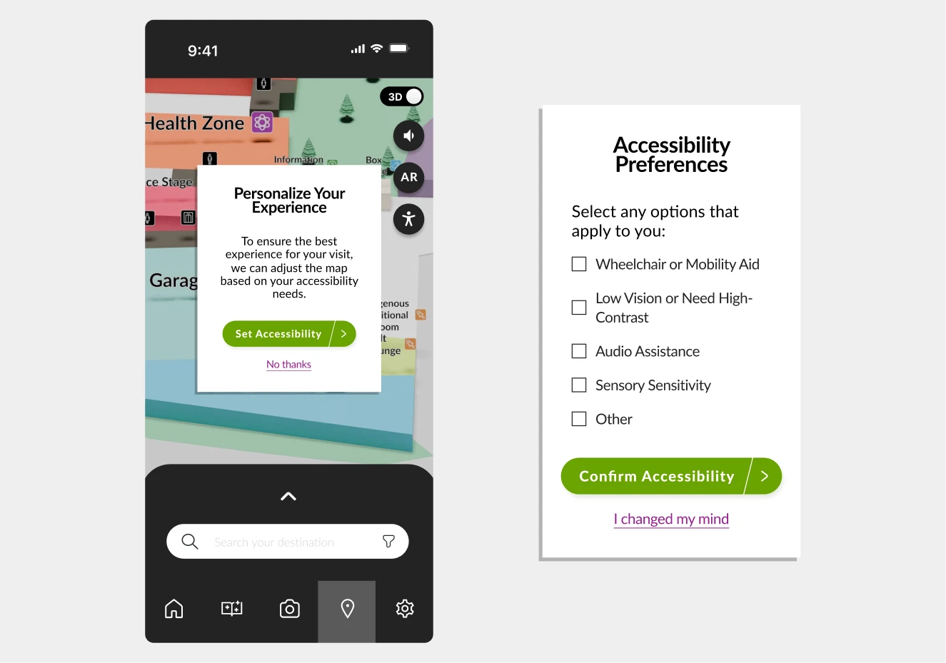
Accessibility built in
High-contrast visuals, audio narration, and simplified language from the start.
Designed from the outset for children, seniors, and visitors with visual or sensory impairments, so the experience works for everyone in the building.
The Problem It Answers
Every one of these gaps hits hardest for the visitors with the least support. High-contrast visuals, audio narration, and plain language answer all four at once.
Research
We toured the building before we designed for it
Working with Telus World of Science and Elixir Simulations, we visited the centre for contextual research, took a tour, and learned where the existing wayfinding and engagement tools fall short. From that, we wrote a user statement and built a persona to keep the work pointed at a real person.
Contextual research
User statement
As a visitor with a strong interest towards science, I want intuitive navigation and engaging interactive elements so I can focus on discovery without getting lost or bored.
Persona

Charlie Stewart, 13
Junior High Student · Edmonton, AB · Smartphone
I like to create things that will amaze my classmates so that I can share my curiosity about science in a way that feels fun for everyone.
Goals
- Learn more about the solar system to finish her science fair project on time.
- Prove how much she has learned while visiting the science centre.
- Show she is responsible enough to explore without her mom.
Pain points
- Loses focus quickly, especially in environments with a lot of visuals.
- Her phone has parental restrictions that limit access to certain apps or features.
- Feels uncomfortable approaching staff or unfamiliar adults for help.
Design
From sticky notes to a building in 3D
We reimagined the visit with the research in hand. I worked across the project and took the lead on the AR prototyping and the 3D model that the map and spatial features run on.
- 01
Workshopped and prioritized
We ran mind mapping, brainwriting, and a prioritization matrix to find the features that would move navigation and engagement the most.
- 02
Mapped flows, then wireframed
We turned task flows into wireframes that kept the app simple to use without losing what it needed to do.
- 03
Led the AR and 3D
I prototyped object scanning and directional guidance in Adobe Aero, and modelled the science centre in 3D to drive the interactive map and spatial features.
AR wayfinding
Pick an exhibit, follow the arrows
Choose where to go. The app draws the route across the floor plan and drops AR arrows along the way, the guidance the prototype overlays on the real corridor.
Upstairs
This floor
Routing to Space Gallery.
Mind mapping
Brainwriting
Task flow
AR and 3D models
Wireframes
Gamified exploration
A stamp for every find
Reach an exhibit and the app rewards it with a stamp. Try collecting the floor: progress, reward, and a reason to keep exploring.
-
Space Gallery
-
Arctic Journey
-
Science Garage
-
Health Zone
Stamp book full.
A static map never made finding things feel like this.
In on-site testing, the stamp book lifted engagement the most, especially for kids.
Testing
Tested with friends, then with real visitors
We ran a pilot with friends and family to sharpen the prototype and our interview script, then tested on-site at Telus World of Science with real visitors, in the place the app was built for.
What we heard
- Worked
The app was intuitive and needed little guidance.
- Worked
The stamp book lifted engagement, especially for kids.
- Worked
Accessibility tools like audio and simple text were well received.
- To fix
The AR and stamp-book icons confused some users at first.
- To fix
Small text and no font options made reading hard for a few.
On-site
Accessibility
Built for everyone, then tested for it
Accessibility was a starting requirement, not a finishing touch. The app ships three things by default, and on-site testing pushed two more out of it.
High-contrast visuals
Stronger colour separation so the map and labels stay legible for low-vision visitors.
Audio narration
Spoken guidance, so the route does not depend on reading a screen.
Simplified language
Plain wording for younger visitors and anyone who finds dense copy a barrier.
The change, in the prototype
One map for everyone became a menu that adapts it.
Before
After
Answering a stamp question
Scanning was the only way in, until it was not
Reach the planet exhibit and the Guide asks a question. At first the only way to answer was to scan it, a wall for anyone with a camera fault or low vision. So we cut a second door. Try both; each one earns the same stamp.
Point the camera at the exhibit and tap the shutter. Quick, when the camera cooperates.
Tap the shutter to scan the exhibit.
Two answer paths shipped: scan the exhibit, or type the answer. The live demo needs JavaScript; the prototype handled both.
What is the biggest planet in our solar system?
Outcome
A tested prototype, and what I took from it
It shipped as a tested prototype: routing you to an exhibit, rewarding the find, and bending to how you need to move. The final design is below.
Reflection
- 01
Built to explore, and to include
We simplified dense content, sharpened the visual hierarchy, and built in gamified learning so the experience stays fun and intuitive.
- 02
Research shaped every decision
On-site testing, interviews, and pilot studies surfaced the real navigation and engagement gaps, and pointed each feature at one of them.
- 03
AR demanded a different kind of thinking
Designing for AR meant prototyping for screen and real-world movement at once, so the guidance felt natural in the building, not just on a phone.